Most moodboards die after the first meeting. Everyone nods, the board goes into a folder, and production starts from memory. By the first round of revisions, nobody can say what the board promised, so the conversation turns into taste against taste. The problem is rarely the images. It is that the board showed a mood and never made a decision.
A moodboard that guides a project is a list of decisions written in images: the color, the light, the type, the composition, the movement and the texture of the piece. If you cannot say out loud what each image decides, it is decoration. These are the rules I use to make a board that is still useful on the last day of the job.
1. Start from the brief, not from the feed
Before you search for a single image, write three words the piece has to feel like, and one it must never feel like. Warm, quiet, precise. Never corporate. Those four words are the filter. Searching first and deciding later fills the board with what the algorithm likes this week, not with what the project needs.
2. Sort by what each reference teaches
A pile of images is not a board yet. Group the references by the question each one answers, and the board starts to read like a plan. (I go deeper into this in Start with references, not with software.)
- Color and light: warm or cold, day or night, clean or grainy.
- Type: serif or sans, tight or airy, loud or quiet.
- Composition: where things sit in the frame, how much empty space there is.
- Movement: the rhythm of a cut, how a camera drifts, how an element enters.
- Texture: paper, glass, metal, film, fabric.
3. Write one line next to every image
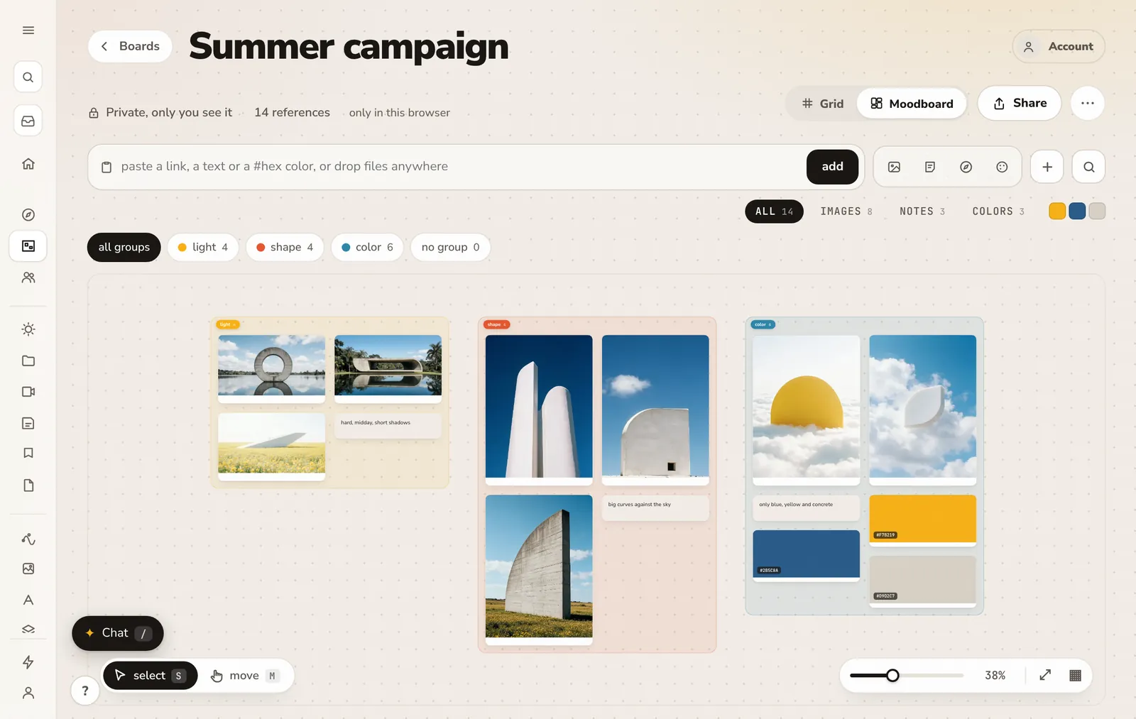
The grain of this one, not the color. Only the way the title enters. One line turns a reference into an instruction. It also protects you in the meeting: when the client points at an image and says “I love this”, the note says which part of it the project is taking. Without the note, every reference is a promise to copy all of it.
4. Cut it down to twelve or twenty
More than twenty images is a library, not a board. A library is useful, keep it, but the board the project follows has to fit on one screen, so anyone can read it in a minute. Cutting is where the decisions happen: when two references say the same thing, keep the stronger one. When one contradicts the four words from the brief, it goes, however beautiful it is.
5. Pull the palette from the board
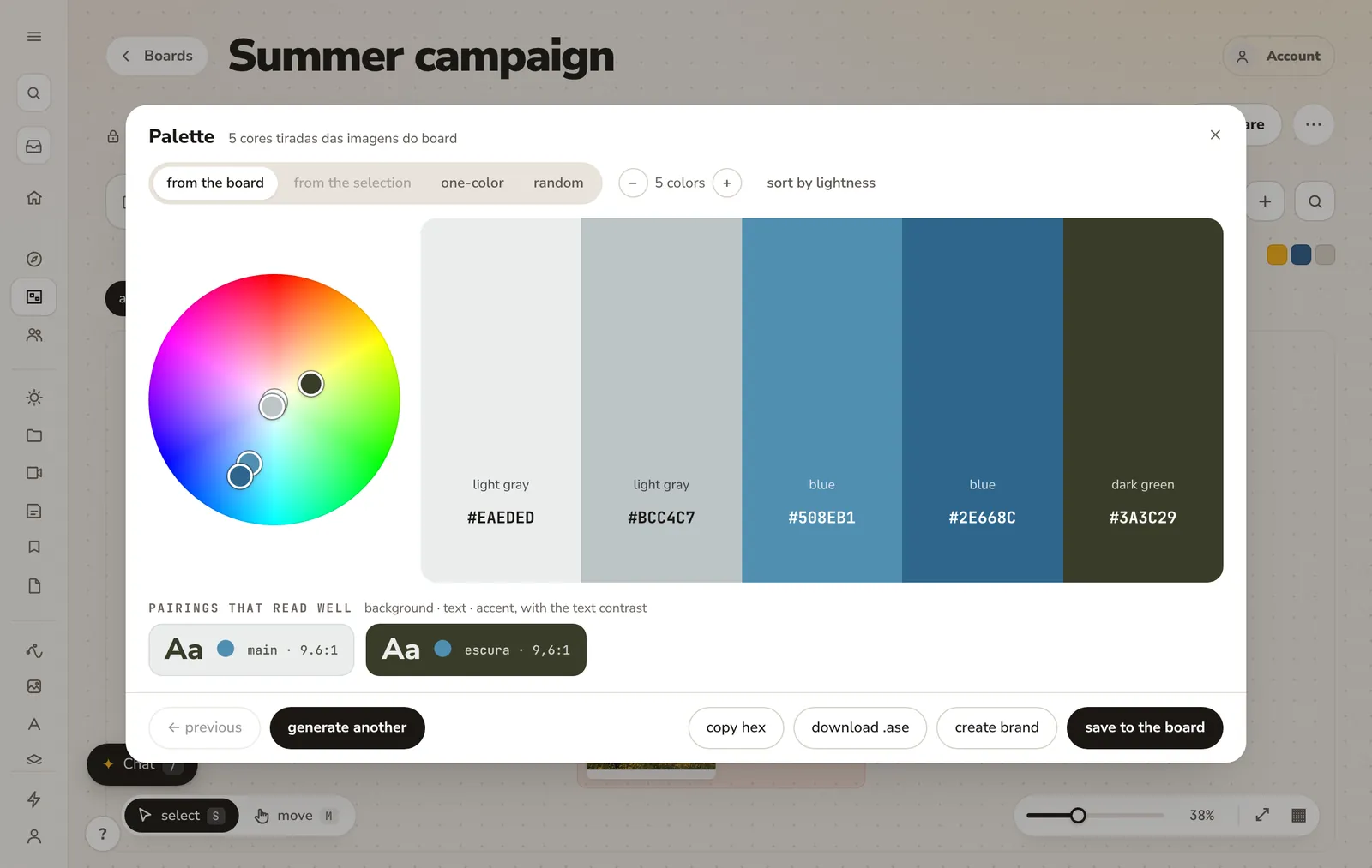
Do not pick the colors from memory and then look for images that match. Pull the palette out of the references you kept, and you get the colors the board actually shows, with the proportions it shows them in. A board that is mostly off white with a little blue asks for a different piece than a board that is half blue.
6. Add a column of what it will not be
Three or four images of what the project is not save more revisions than the rest of the board. They make the fourth word from the brief visible. A client who sees the glossy stock photo crossed out on day one rarely asks for it on day twenty.
7. Keep the board next to the work
A board that lives in a separate app gets opened once. A board that lives inside the project, next to the brief and the tasks, gets opened in production, in revisions and at delivery. That is when it earns its place: when a round of revisions comes in, compare the request with the board before you open the file. Half the time the answer is already on it.
The checklist
- Three words it has to feel like, one it never can.
- References grouped by what they teach.
- One line next to every image.
- Twelve to twenty images on the board, the rest in a library.
- A palette pulled from the board.
- A few images of what it will not be.
- The board inside the project, opened again at every revision.
Next time you build a board, give it twenty minutes and one rule: no image goes in without a line that says why. The board will be smaller, and the project will follow it.